Checkout Flow Revamp
This project focuses on the redesign of the shopping bag and checkout pages to streamline the user’s purchase journey. These enhancements aim to simplify decision-making and elevate the checkout experience.
Role
Lead Designer
Area
Design, Strategy
Platform
Web, App
CONTEXT
Too Much Friction, Too Many Drop-Offs
With new features and business strategies in place, the current checkout flow has become too complex as our users are often faced with:
Cluttered interface with too many competing elements and repetitive text
Irrelevant or poorly placed promotional messaging
Wordy and inconsistent copy makes information harder for user to understand
Confusing, lengthy, and difficult-to-use input fields
Checkout failures triggered by gift card and product logic
These problems are backed by user testing and heatmap data. As this page is a high-value and decision-heavy part of the customer’s journey, we prioritized rethinking the design and strategies of these pages, while ensuring they serve both business goals and user needs.
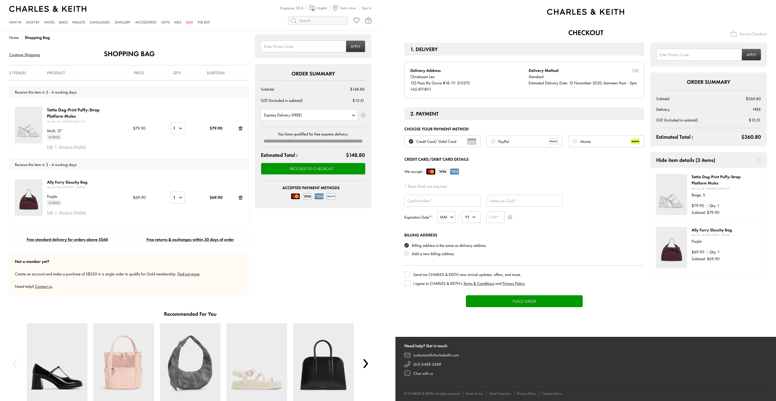
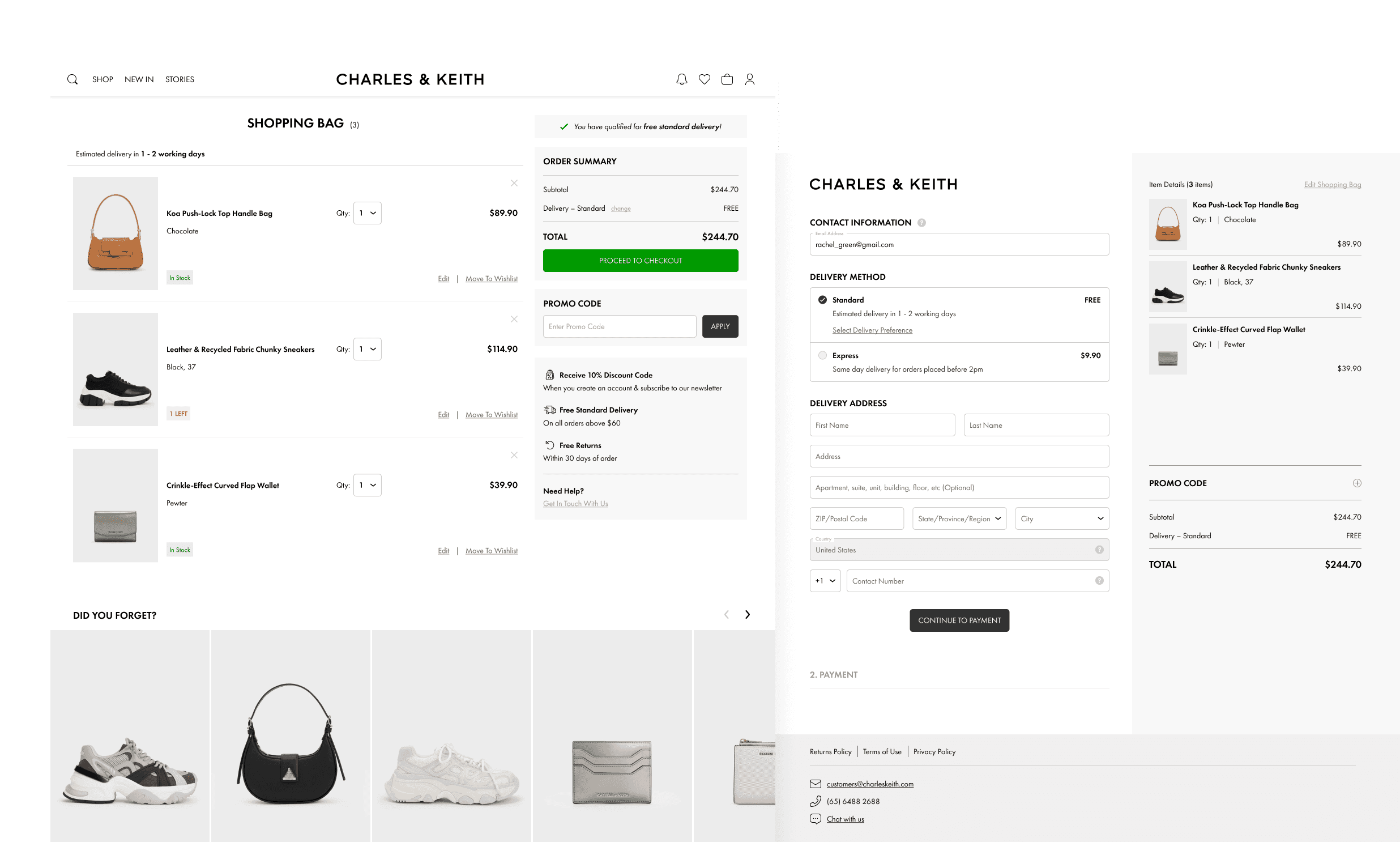
THE SHOPPING BAG
Designed for Decisions
The priority for the Shopping Bag page was to support user decision-making and reduce hesitation, while lightly cross-selling relevant items.
Better Product Clarity: Key product details are emphasised and laid out in a way that is easy to scan
Smarter Grouping: Split shipments and timelines are grouped together to reduce overload of repeated information
Less Noise: Value props and cross-sell items are moved outside the core layout to prevent users from going back into the browsing journey.
Refine Checkout Path: Gift card and OOS items no longer block progress to checkout
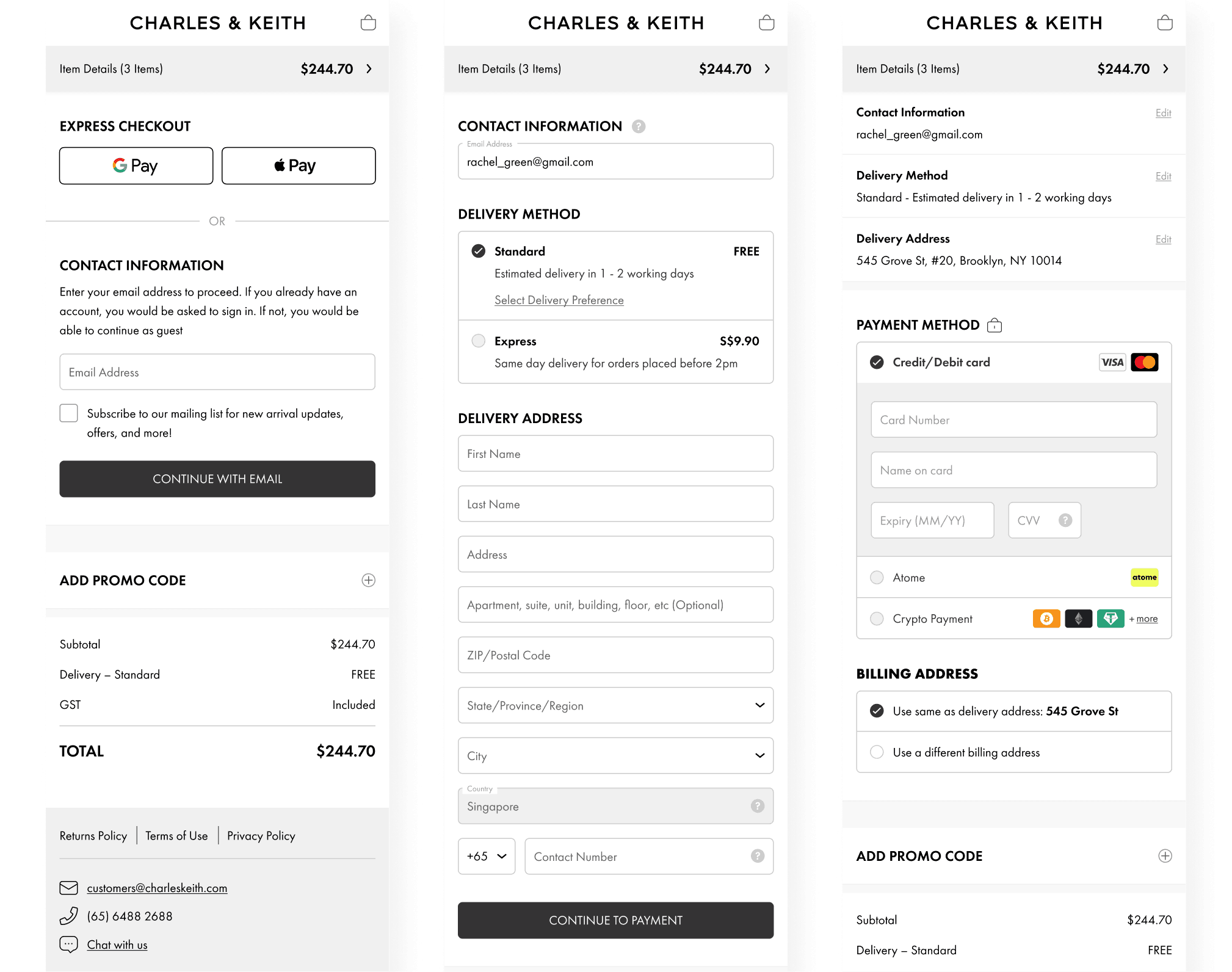
THE CHECKOUT PAGE
Smoother, Shorter, Smarter
Given the complexity of our checkout — from multiple delivery options to various payment methods — we opted for a hybrid flow instead of a traditional single-page or multi-step approach. This allowed us to simplify the user experience while accommodating business requirements like guest checkout, gift card redemption, and third-party payment integrations.
In our new checkout experience, we simplified the process:
Adjusted Address Fields: Removed redundant fields, adjusted the form labels and placeholder copies to provide clarity.
Clearer Delivery Options: Reduced heavy copies of delivery information, and wrote them in a way that is easy for users to scan and compare their options.
Informative Payment Section: Provide clearer next-step instructions for options with external redirect.
Implement a Email-First Entry: Prioritised login/account linking with an email-first entry model to reduce perceived complexity
PROJECTED OUTCOMES
Quantifiable Goals
These estimates are based on usability testing, analytics insights and industry benchmarks as the project is currently in development.
~12% increase in checkout completion rate, based on fewer required fields and a more intuitive address and payment structure.
~8% reduction in cart abandonment, this is tied to clearer item information and stock handling in the shopping bag
~25% improvement in mobile task completion time, due to simplified layout and processes.
Reduced support tickets related to delivery and payment information